
A great luxury and pleasure in retirement is having as much time as I want to read and think. I’m re-reading art books I’ve not touched in years and am finding new insights about why some artists resonate with me so strongly.
In addition to Richard Diebenkorn, I admire the work of American painter, Edward Hopper (1882-1967).
Two of Hopper’s most famous figurative works, Chop Suey (1929) and Nighthawks (1942), may be familiar to you.
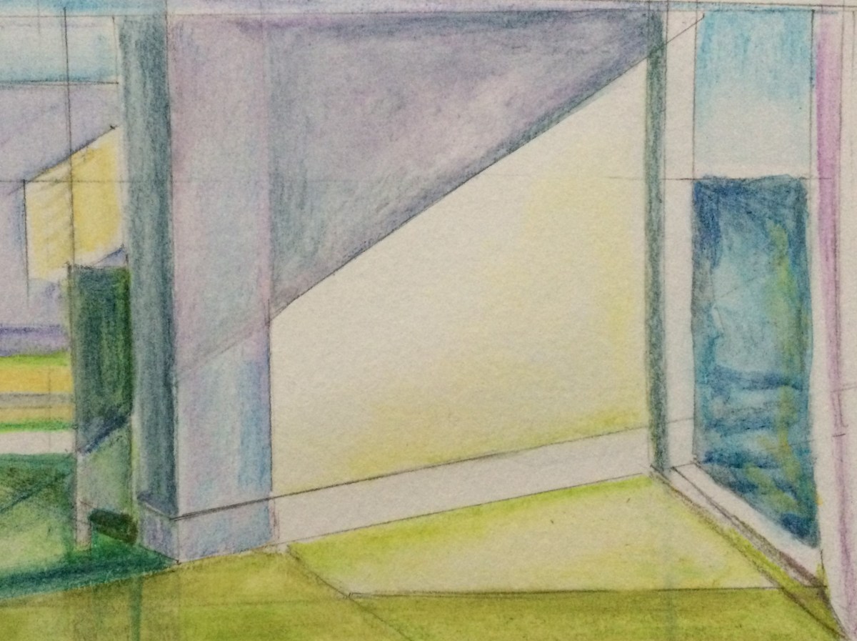
His later works, including Rooms by the Sea (1951) and Sun in an Empty Room (1963), present strong lights and shadows in simpler, almost abstract ways which remind me of Diebenkorn’s Ocean Park series. Hopper was the older of the two notable artists, and it’s more than possible that Diebenkorn was aware of and influenced by Hopper’s work. I like to think so.
Both artists are in my mind these days. I love the Diebenkorn abstracts and Hopper’s bold colors and values. As I begin to draw and paint again after many years, I struggle to make the right value contrasts and my palette is beginning to feel a bit timid. But I draw courage from Hopper’s powerful and stunning use of color, light and shadow.
In this watercolor study, I imagined Hopper’s Rooms by the Sea through a Diebenkorn ‘lens.’ In doing so, I learned that I still need to work on my values contrasts, and I need more confidence with color and form.
Artists Wolf Kahn and Josef Rafael also inspire me and I will write about them in future posts.
Who influences your work?

I love how both artists are able to use light and shadow so effectively.
LikeLike
Thanks for your comment. Light is everything, especially in these dark winter days. Happy new year to you!
LikeLike