An image continues to inspire

Long ago when I was making cloisonné enameled jewelry,  I made a series of reversible pendants that featured a waterlily on one side and an abstract design on the other.

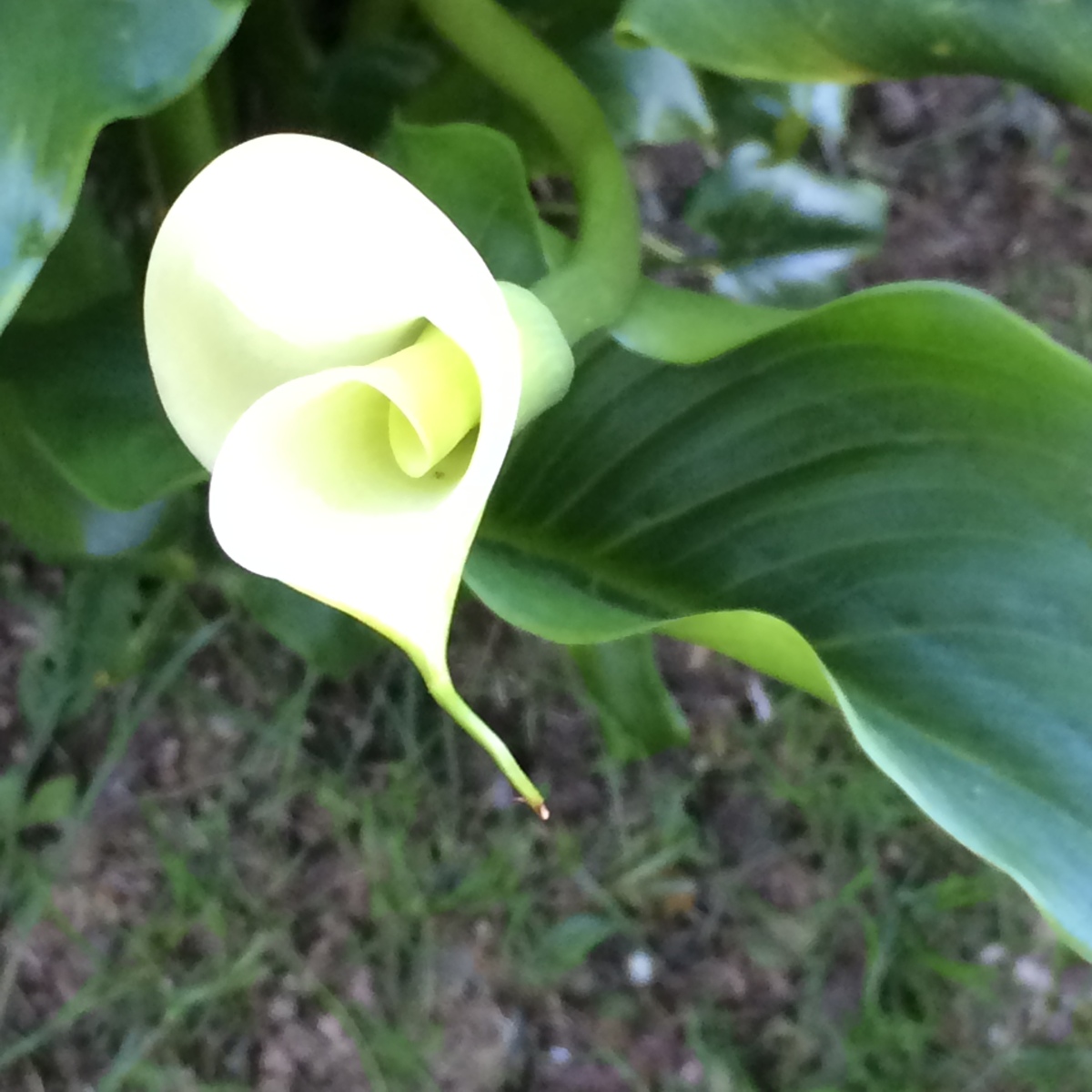
My inspiration for the waterlily was a watercolor painted by John La Farge in the 1880’s, which is now housed at the Smithsonian in Washington, D.C.  In recent years this lovely image has been licensed to appear as framed prints, on greeting cards and likely many other media. You’ve likely seen it somewhere, too.

Using his work as my own starting point, I simplified and changed it in many ways to suit my pendant format which was usually a rounded rectangle about and inch by an inch and a half. I created and sold many variations over several years and I hope they’ve held up well and continue to give their owners pleasure. For me, the waterlilies and their more abstract  ‘other sides’ were a joy to make with up to 6 layers of various transparent colors on each side of the fine (pure .999) silver surface. The white metal base allowed light to reflect through the glassy layers, each fired separately in a super hot kiln, creating jewel-like colors that remind one of stained glass.  In addition to layering pure colors, I did a lot of blending and shading of colors in the leaves, flower petals and watery surface, making each piece unique.

Waterlily pendant
One of my waterlily pendants framed with a sterling silver bezel – made in the early 1980’s. I’ll show you the other side – an abstract design – another time.

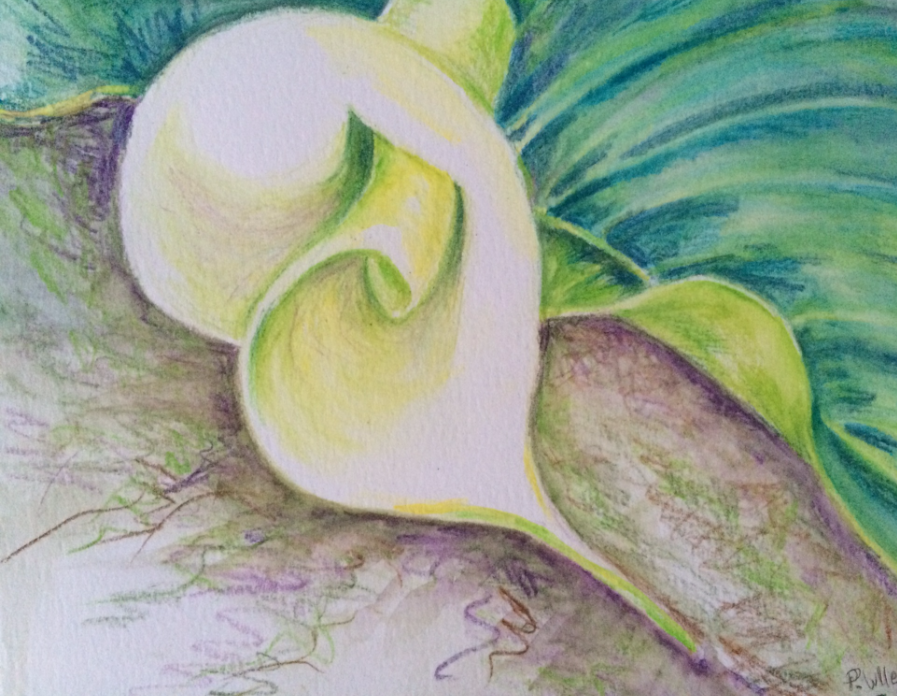
I no longer make jewelry. I have mixed feelings about this. But I gave most of my tools and supplies to various artists and friends as my business career became my main focus for many years. However, I kept my sketches and a few photos and have recently begun to review them to see which might provide ideas or themes to carry forward.

A few months ago, I found a greeting card bearing John La Farge’s original water lily, which was like seeing an old friend. At about that same time I had signed up to study for a day with an amazing pastel artist, Barbara Benedetti Newton. I wasn’t sure what to expect but I took a few recent sketches and the La Farge card with me to her studio, to use as reference images. I decided to use the water lily for my project that day, in hopes that my being so familiar with his image would allow me to focus more on learning how to handle pastels with panache.

Barbara was generous with her expertise and even let me use a few of her own gorgeous colors to supplement my small pastel supplies. She also showed me how to use a toned pastel paper as a complement to my main colors and as one of the mid values I’d need in the painting. Barbara even gave me samples of other substrates for pastels – a whole new array of materials to consider. And her indoor dust capture system makes it possible to use pastels without breathing in their dust. Genius!

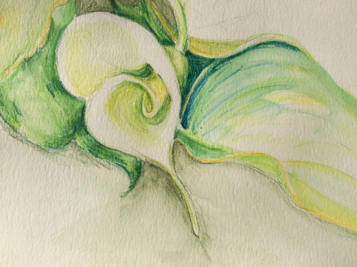
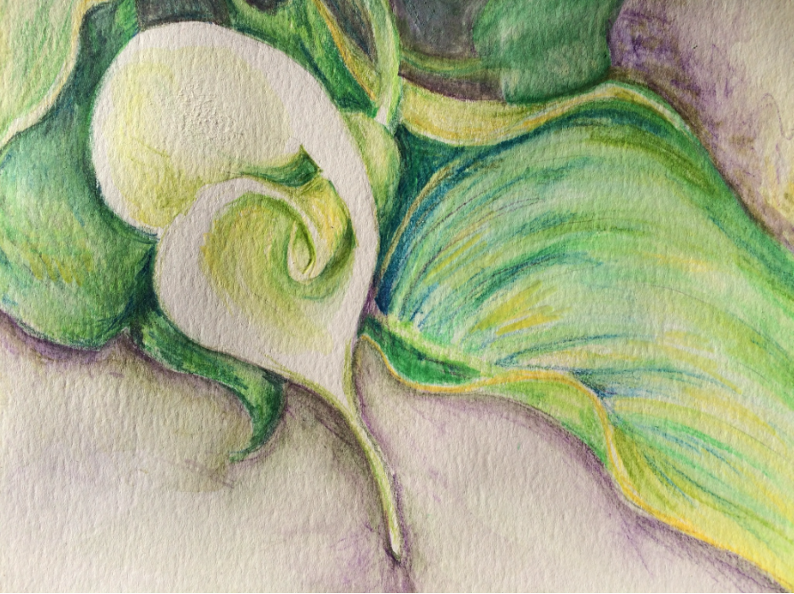
The following series of photos shows the steps Barbara helped me take to create in this medium.

BBN open studio value study phase 1
Step one, a rough sketch with a pastel pencil on an orange toned pastel paper. Above the tape you can see color tests. Then we blocked in the darkest and lightest points. Note the open wire grid below the panel, where a vacuum system captures any falling dust.

With pastels, colors are not mixed on a palette. Variations in color and texture are achieved by layering them in various light or heavy strokes.

BBN open studio lights on
Next I applied more lights and mid tones, leaving some paper showing to provide contrast.
BBN value check phase 2
At this point we took a photo and used the black and white filter to consider whether the values were on target to achieve what I wanted.  Once corrections were made I added final details below.
BBN open studio v3 cropped close
Finished.

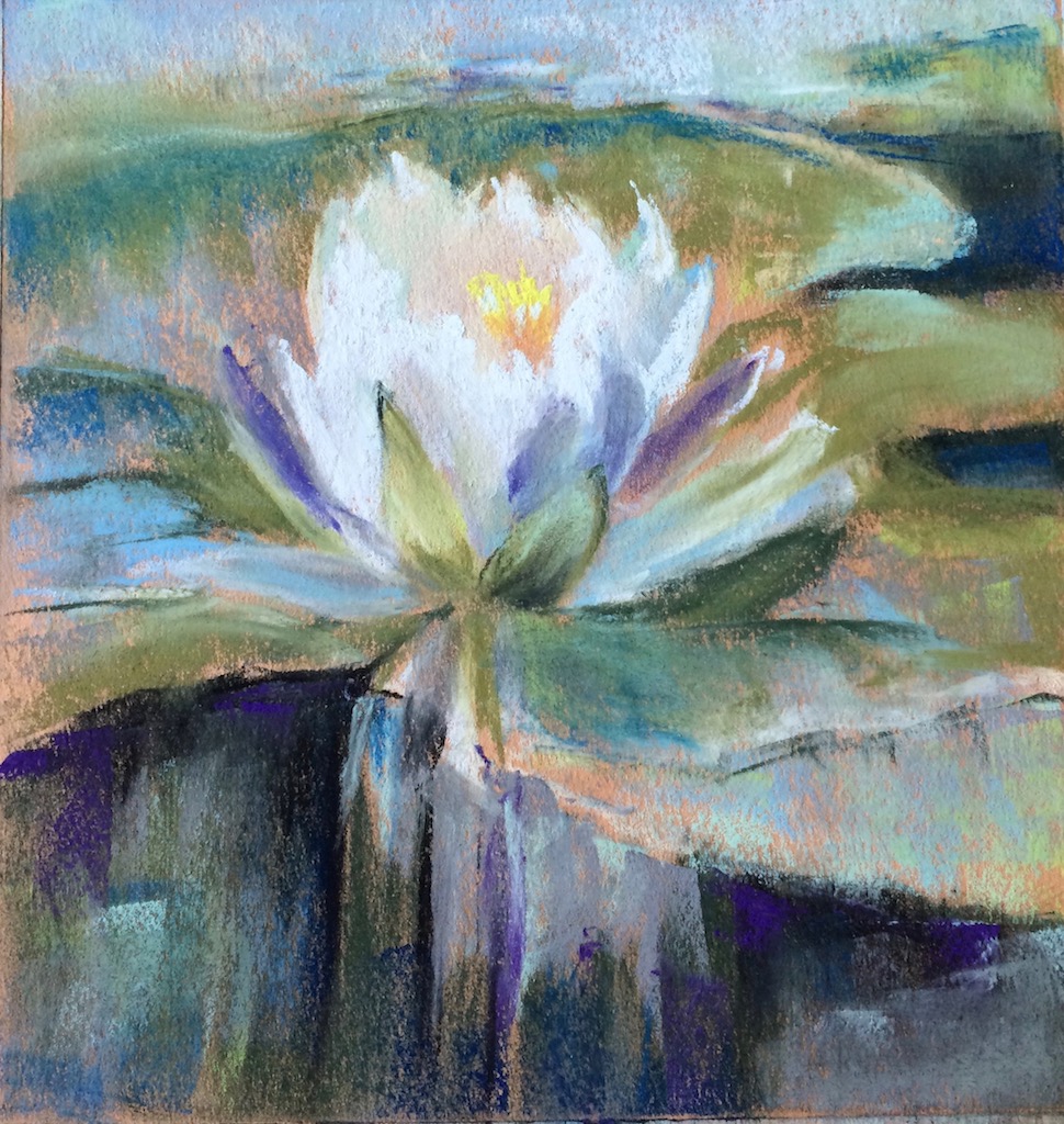
The still visible marks and strokes and those final darks and lights make me happy. And it’s not overworked, thanks to Barbara saying “STOP!”  My time with her was a treat and I love knowing that she lives close enough to Seattle for me to consider her a neighbor. Do visit Barbara’s blog for more about her and to see her stunning work. She’s a treasure and her pastel ‘answer book’ is a goldmine for anyone considering this medium.

Pastel practice

Taking a break from watercolor and pencil drawing, last month I dove into an online beginner’s course for pastels at Artist’s Network. The instructor, Chris Ivers, offered the opportunity to follow her step-by-step demonstrations from her own reference photo. Here is my first effort to work along with her:

Pastel practice cropped

Next, I worked from my own photo taken on a walk in my neighborhood last fall.  I like this stand of bamboo and think the strong directional angle of the sidewalk makes an interesting composition.

Bamboo walk pastel

I like the immediacy of the soft pastels and the ability to layer and blend them. Even to brush off any mistakes and work over areas, building up rich color and texture.

Taking this online course also gave me the confidence to sign up for a one day workshop with a very well known pastel artist, who, I recently learned, lives near Seattle. I have long admired Barbara Newton’s pastels, and I am delighted to have the opportunity to study with her next month.

Now, back to more practice.


Creative Synchronicity (Part 1)

JOSEPH RAFFAEL’s HELLEBORES

In her book about creativity and retirees, Julia Cameron warns (or perhaps promises) that ‘aha!’ moments – ephiphanies about creative synchronicity – occur when we nurture our innate creativity and pay attention to the world around us.  Recently, I’ve begun to  experience such instances and I am seeing more connections between my long ago artist self, what I am doing now and others’ creativity.

Perhaps these examples of creative syncronicity have swirled around me, invisible as air currents, for years, when I was just too terribly busy to see them. Now I am making time to study my art influencers anew and taking steps to make art again. With the luxury of time to savor these efforts, I begin to feel lightbulbs illuminating above my head.

For example, a few days after I posted about my hellebore sketches, which were prompted by Susan Rushton’s luscious photos of these early spring bloomers, I received a new edition of artist Joseph Raffael’s newsletter, announcing his own new stunning hellebore painting.

I’ve long respected Raffael’s work and it was a joy to see his painting on the same subject I’d been working on. His hellebore painting felt like a gift, showing me how much more I could possibly achieve with watercolor in the future.  He even focused on a side view of one blossom and it’s complex interior that I’d found interesting, too.  (My side view is posted above, but go to Joseph’s site to see his elegant interpretation.)

The first Raffael painting I encountered was one of his “Water Paintings” at the Chicago Art Institute.  Forty years ago, that massive riverscape dazzled me with shimmering surfaces, jewel-like reflections and mysterious watery depths,  He inspired me to try to capture light in my own work in various translucent and transparent media, including glass enamels, watercolors and stained glass.

Raffael’s art currently explores the complex worlds contained within a few flowers or a single blossom. He continues to amaze and inspire. You can sign up for his newsletters at his site and follow his new work as he completes each painting.

Enjoy!

Edward Hopper: Color and Contrast


A great luxury and pleasure in retirement is having as much time as I want to read and think. I’m re-reading art books I’ve not touched in years and am finding new insights about why some artists resonate with me so strongly.

In addition to Richard Diebenkorn, I admire the work of American painter, Edward Hopper (1882-1967).

Two of Hopper’s most famous figurative works, Chop Suey (1929) and Nighthawks (1942), may be familiar to you.

His later works, including Rooms by the Sea (1951) and Sun in an Empty Room (1963), present strong lights and shadows in simpler, almost abstract ways which remind me of Diebenkorn’s Ocean Park series. Hopper was the older of the two notable artists, and it’s more than possible that Diebenkorn was aware of and influenced by Hopper’s work. I like to think so.

Both artists are in my mind these days. I love the Diebenkorn abstracts and Hopper’s bold colors and values. As I begin to draw and paint again after many years, I struggle to make the right value contrasts and my palette is beginning to feel a bit timid. But I draw courage from Hopper’s powerful and stunning use of color, light and shadow.

In this watercolor study, I imagined Hopper’s Rooms by the Sea through a Diebenkorn ‘lens.’  In doing so, I learned that I still need to work on my values contrasts, and I need more confidence with color and form.

hopper-4

Artists Wolf Kahn and Josef Rafael also inspire me and I will write about them in future posts.

Who influences your work?


Who are your creative influencers?

I’ve always admired American painter Richard Diebenkorn (1922 – 1993) and today I was struck to recognize his influence on some artwork I created years ago in a totally different medium.

Diebenkorn’s Ocean Park series series has long fascinated me for reasons I don’t fully understand. But one of our first purchases as a young couple was a framed Diebenkorn poster featuring his 1970 painting, Ocean Park #29. We’d just moved into our first apartment in a small college town and though money was tight, we splurged on some art for our walls.

Fortunately, the Diebenkorn poster survived many moves and currently hangs in my ‘studio.’ So it was very convenient to use as a reference for my first watercolor pencil exploration.

I hoped that by recreating #29 in a very small size and a different medium, I could quickly practice drawing, try out the pencils and understand more about why this particular painting charms me so. Why was Diebenkorn using this color next to that? What was his purpose using the diagonal while line? How does he blend his colors and lines?

Though Diebenkorn worked in oils for his OP series, I was also eager to see whether I could hold a firm edge between various watercolors while still making something painterly.

In my homage to Mr. Diebenkorn, below, my jewel tones evoke transparency and light.

deibenkorn-homage-1

I based another sketch, below, on his Ocean Park #79 (1975).

Reinterpreting the Diebenkorns does not make my qiuck sketches original art. But studying them in this way has simply helped me learn more about his work and how I might apply what I’ve learned in the future.

deibenkorn-homage-2

However, this morning, as I was dusting off and browsing through some old design sketchbooks from my jewelry making days, I could see his influence in my series of cloisonne enameled pins/brooches and pendants. These three pieces relate to his work, but I never realized that until today.

enameled-jewels

Perhaps our influencers affect us differently at various times in our lives.

Whose influence fuels your creativity?


They say it takes two…

…Two people, that is, to create an artwork.  One to bring it into existence and another to say “STOP” when it’s finished.

Have you ever taken a good drawing or painting too far and ruined it?

I’ve blown up several sketches over the past couple of days, but I DID draw or paint each day so far this year. All five days of it. And I am not ashamed to share a couple of  watercolor pencil drawings/paintings.

Working from photos I took in my garden last May, these made me happy today:

Reference photo from May, 2016:photo-for-calla-wcp

My water color version, January 4, 2017:

wc-calla-mid-stage

I liked this but went further with it. Looking at the version below, I wish I’d listened to that voice that said, Stop!

Final Calla Lily, January 4, 2017:

Calls Jan 4 FINAL.png

I am not sure the addition of the small leaf at top right adds anything to the composition, though I do like the more atmospheric areas around the flower and leaves and the darker values add drama.

I’m glad to have photos of both stages so that I did not lose what I liked about the first version.

Today, I drew from a different reference photo, also from May 2016:

calla-for-jan-5-wcp

My January 5 interpretation, in watercolor:

calla-jan-5-final

Callas are dramatic flowers and interesting to draw.

Years ago, I made jewelry and created many cloisonne enameled pendants featuring this flower. I sold them all but wish I had kept one.  My original design sketches and photos of some finished pieces are tucked away somewhere. It might be time to review them and see what I can learn from them this year. I sense the need for another round of closet cleaning to find them. Oy!

However, for now, I am excited that new callas will emerge in my garden in a few months.

The days are already lengthening and I know that Spring is coming.