Experiments in Pink

Today’s WP daily prompt is PINK, so it’s a good day to share some recent sketches of a day lily I photographed in my garden last June. A few weeks ago, using a combination of Tombow pens, watercolor paint and Inktense pencils, I created a satisfying range of pinks in these two versions:


Though their name prepares us that each lily flower will last only one day, I am amazed the plant expends so much energy for such short lived beauty! When these beauties are in bloom, I try to spend time in the garden each day so I don’t miss a single blossom.

Thank you, Susan Rushton

Several weeks ago, I was itching to try some new art tools. I’d treated myself to a starter set of Inktense pencils and dozens of new Tombow markers. But I was stumped for subject matter.

Fortunately, I follow Susan Rushton’s blog. Her early February post and photos of seemingly ‘demure’ hellebores revealed stunningly complex and fascinating flower interiors normally hidden from view.  Wow!

The hellebore’s downward-facing flowers had seemed, until then, uninteresting in the early spring garden.  But Susan’s images and comments changed my mind and inspired me to visit my local nursery, where I found several varieties, capturing some reference photos for my test sketches.

Just yesterday, Susan posted again about hellebores, so the time seems right to thank her for her for giving me a new appreciation for these garden charmers.

Here’s how I’m seeing them in a few sketches using Inktense dye pencils, overlaid in some cases with watercolor, and with Tombow pens, which blend beautifully.

helibores inktense sketch March 2017

two helibores March 2017

helibore side show B March 2017

lighter side show helibores

helibore upclose March 2017

Edward Hopper: Color and Contrast


A great luxury and pleasure in retirement is having as much time as I want to read and think. I’m re-reading art books I’ve not touched in years and am finding new insights about why some artists resonate with me so strongly.

In addition to Richard Diebenkorn, I admire the work of American painter, Edward Hopper (1882-1967).

Two of Hopper’s most famous figurative works, Chop Suey (1929) and Nighthawks (1942), may be familiar to you.

His later works, including Rooms by the Sea (1951) and Sun in an Empty Room (1963), present strong lights and shadows in simpler, almost abstract ways which remind me of Diebenkorn’s Ocean Park series. Hopper was the older of the two notable artists, and it’s more than possible that Diebenkorn was aware of and influenced by Hopper’s work. I like to think so.

Both artists are in my mind these days. I love the Diebenkorn abstracts and Hopper’s bold colors and values. As I begin to draw and paint again after many years, I struggle to make the right value contrasts and my palette is beginning to feel a bit timid. But I draw courage from Hopper’s powerful and stunning use of color, light and shadow.

In this watercolor study, I imagined Hopper’s Rooms by the Sea through a Diebenkorn ‘lens.’  In doing so, I learned that I still need to work on my values contrasts, and I need more confidence with color and form.

hopper-4

Artists Wolf Kahn and Josef Rafael also inspire me and I will write about them in future posts.

Who influences your work?


The color in the shadows

It’s cold and rainy this week in Seattle and I am housebound today with a wrenched back. Perhaps I was overconfident in my yoga classes last week. The extra backbends seemed like a good idea at the time.

However, I want to put a new header image on the blog so I went back to the well of my garden photos from last May and drew/painted a a series of small calla sketches, about 1.5 inches each, to get the right proportions for the wide, narrow header.

callas-for-header-image-cropped

I’m happy so see that I’m loosening up with the watercolor pencils and paints. The small scale of these sketches also forced me to simplify. Applying what I learned today I will make a larger version of each little sketch later this week as I continue to explore these fascinatingly-shaped flowers.

Though these callas are white, they reveal so many other colors in their folds and shadows.

I first saw colorful shadows in Santa Fe, where the elevation and brilliant sunlight created the most amazing purple and green shadows in the corners of adobe walls and buildings.  I had never seen this where I’d grown up, in Ohio.

On sunny winter days, look for colors in snow shadows; they are never just gray. There are so many colors in the icy crystals as the sun changes throughout the day.

Have you been to other places where you’ve seen this phenomenon of color in shadow?


Who are your creative influencers?

I’ve always admired American painter Richard Diebenkorn (1922 – 1993) and today I was struck to recognize his influence on some artwork I created years ago in a totally different medium.

Diebenkorn’s Ocean Park series series has long fascinated me for reasons I don’t fully understand. But one of our first purchases as a young couple was a framed Diebenkorn poster featuring his 1970 painting, Ocean Park #29. We’d just moved into our first apartment in a small college town and though money was tight, we splurged on some art for our walls.

Fortunately, the Diebenkorn poster survived many moves and currently hangs in my ‘studio.’ So it was very convenient to use as a reference for my first watercolor pencil exploration.

I hoped that by recreating #29 in a very small size and a different medium, I could quickly practice drawing, try out the pencils and understand more about why this particular painting charms me so. Why was Diebenkorn using this color next to that? What was his purpose using the diagonal while line? How does he blend his colors and lines?

Though Diebenkorn worked in oils for his OP series, I was also eager to see whether I could hold a firm edge between various watercolors while still making something painterly.

In my homage to Mr. Diebenkorn, below, my jewel tones evoke transparency and light.

deibenkorn-homage-1

I based another sketch, below, on his Ocean Park #79 (1975).

Reinterpreting the Diebenkorns does not make my qiuck sketches original art. But studying them in this way has simply helped me learn more about his work and how I might apply what I’ve learned in the future.

deibenkorn-homage-2

However, this morning, as I was dusting off and browsing through some old design sketchbooks from my jewelry making days, I could see his influence in my series of cloisonne enameled pins/brooches and pendants. These three pieces relate to his work, but I never realized that until today.

enameled-jewels

Perhaps our influencers affect us differently at various times in our lives.

Whose influence fuels your creativity?


They say it takes two…

…Two people, that is, to create an artwork.  One to bring it into existence and another to say “STOP” when it’s finished.

Have you ever taken a good drawing or painting too far and ruined it?

I’ve blown up several sketches over the past couple of days, but I DID draw or paint each day so far this year. All five days of it. And I am not ashamed to share a couple of  watercolor pencil drawings/paintings.

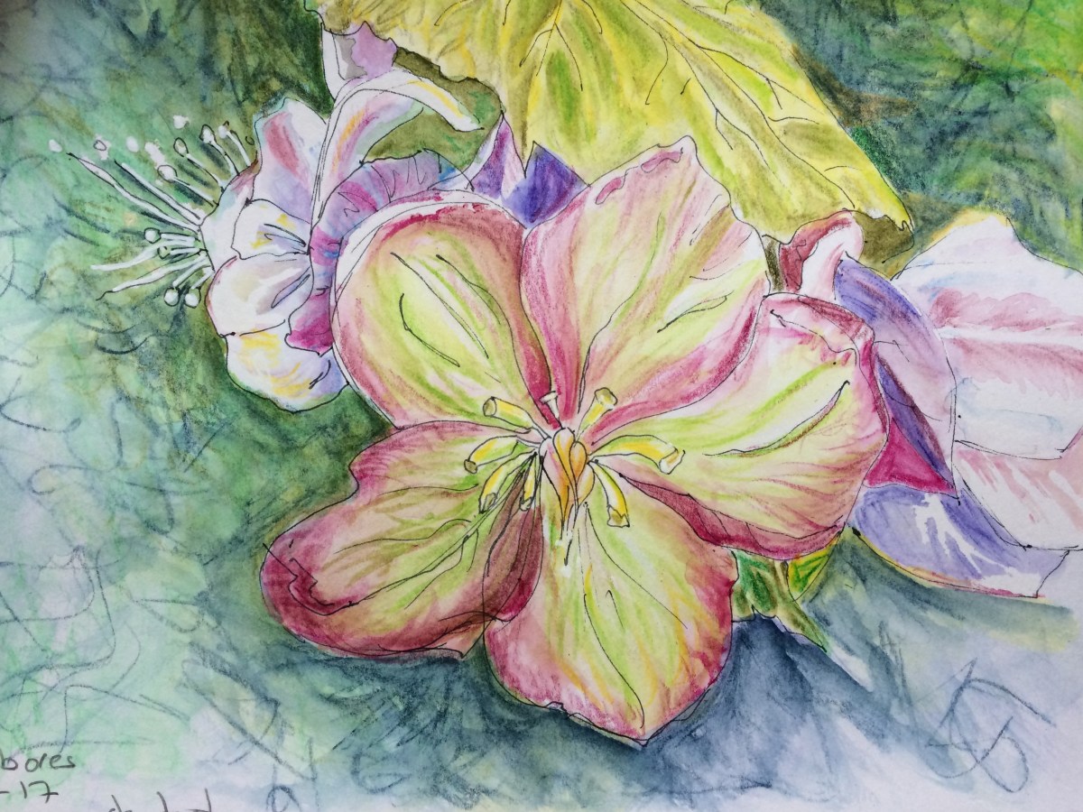
Working from photos I took in my garden last May, these made me happy today:

Reference photo from May, 2016:photo-for-calla-wcp

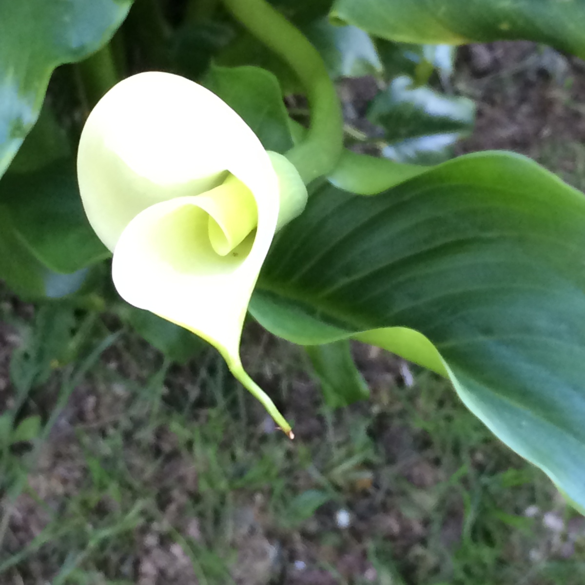
My water color version, January 4, 2017:

wc-calla-mid-stage

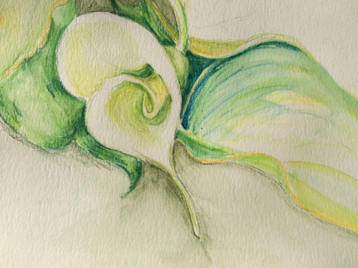
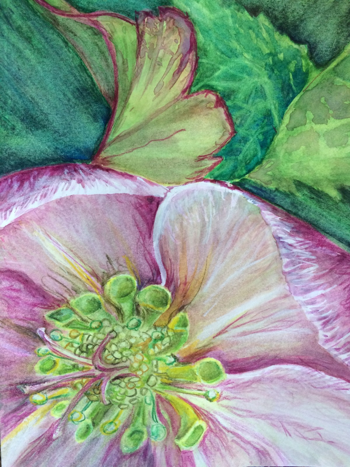
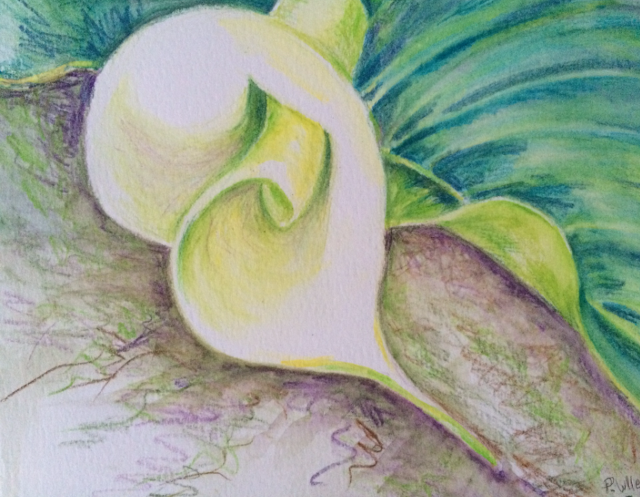
I liked this but went further with it. Looking at the version below, I wish I’d listened to that voice that said, Stop!

Final Calla Lily, January 4, 2017:

Calls Jan 4 FINAL.png

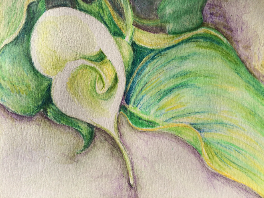
I am not sure the addition of the small leaf at top right adds anything to the composition, though I do like the more atmospheric areas around the flower and leaves and the darker values add drama.

I’m glad to have photos of both stages so that I did not lose what I liked about the first version.

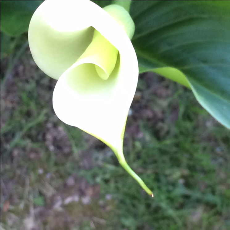
Today, I drew from a different reference photo, also from May 2016:

calla-for-jan-5-wcp

My January 5 interpretation, in watercolor:

calla-jan-5-final

Callas are dramatic flowers and interesting to draw.

Years ago, I made jewelry and created many cloisonne enameled pendants featuring this flower. I sold them all but wish I had kept one.  My original design sketches and photos of some finished pieces are tucked away somewhere. It might be time to review them and see what I can learn from them this year. I sense the need for another round of closet cleaning to find them. Oy!

However, for now, I am excited that new callas will emerge in my garden in a few months.

The days are already lengthening and I know that Spring is coming.

Ten minutes to better

Responding to a Ten Minute Challenge to improve artskills, I roughed out six water color sketches of one object on a single sheet of paper. Timing myself, I spent no more than ten minutes a sketch, and there was no pressure to perfect each one.

Starting with the panel in the top left and ending at bottom right, I find it fascinating to see how much fresher and looser my work had become in just one hour. Encouraging.

pear-10-minute-challenge


Our next 365-day trip around the sun

I love the idea of each year – either starting on January 1 or on our birthdays – as a 365-day trip around the sun. Thinking this way generates a completely different perspective on how I used (or squandered) the previous year. And how I could use the gift of all this time and space travelling in the year ahead.

2016 was a milestone for me. I retired. I floundered. But I finally began to figure out a new sense of identity and purpose. (Thank you, Julia Cameron!) With the help of her book for ‘retirees and other creative souls’ I recalled all the creative endeavors I tried, starting in childhood, and realized that I now have time to revisit and explore them anew if I choose.

For example, below is an abstractish watercolor landscape I painted some 30 years ago.

I found it when cleaning closets last spring (in my post-retirement floundering period) and was sad to see that it had become foxed and could not be saved. Its frame had been broken when we moved to Seattle 16 years ago, and since then it had been sitting in a closet, absorbing moisture. Oy. Before I consigned it to the dustbin, I snapped a photo. Now I am glad I did because I might try to recreate or improve upon it.

lost-watercolor-no-border

I am ready for 2017!

I’m now structuring my days to flex my mental and physical art making muscles. I already feel better for doing both.

I’m at the gym or taking a brisk walk every day, striving to find the joy in exercise. Haven’t yet but I do like having more energy and feeling stronger.

More interestingly, I’ve created a studio space in my home where I can drop in and out to work when I wish. I try to spend at least one hour there each day, drawing, painting or exploring other artists’ WP sites or at Daily Paint Works, which is a treasure trove of small artwork by daily painters. They also offer tutorials – some free and others for a small fee. Great resource.

DPW has inspired me to try to complete a drawing or painting each day in 2017. Tomorrow I will post number 1.

In 2017, I also aim to reconnect with people who have been important influencers in my art life. I will write about them in the coming months and hope you will be inspired by them, too.

Please feel free to scoop up any Artfuel you find here, and use it to feed your own creativity. The new connections I’m making with creative people here on WordPress and in other communities I am finding are certainly nurturing my creativity. Thank you for the Artfuel you contribute here.

Cheers and Happy New Year!