Begin. Again.

The past several months have certainly presented us all with challenges, but they’ve also offered surprising opportunities to draw and paint with artists who are generously teaching on their websites and other online platforms. Many are offering free sample lessons as a way to attract new paying students and that seems a very fair exchange to me. A few have led me to try new subjects or materials that I’d not been attracted to before.

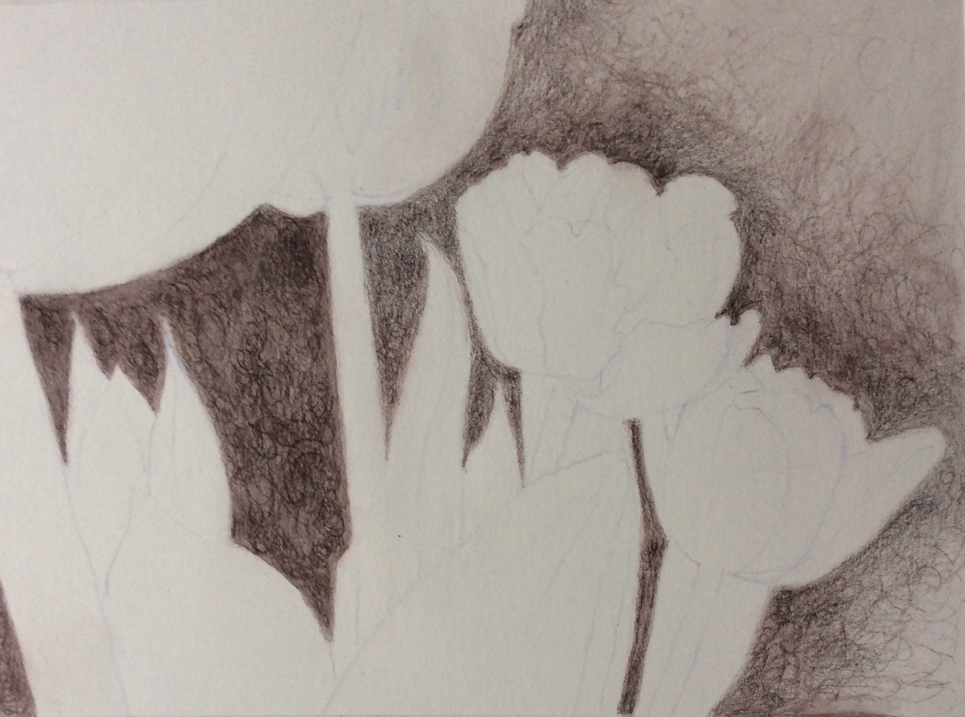
For example, I’ve never been much interested in pencil drawing or depicting animals. But I produced this graphite image of a sheep from a Drawing Together session, using the instructor’s reference photo. I rather like the texture of the wool and grasses. Especially the grasses.

Peggy Willett’s version of a Drawing Together topic

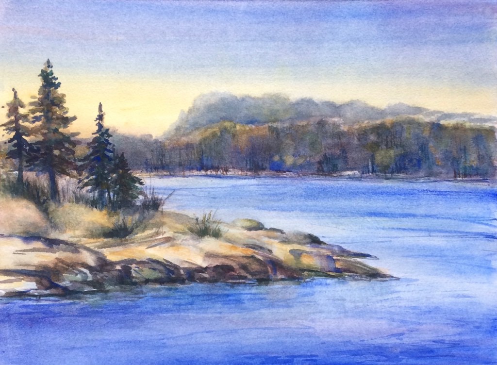
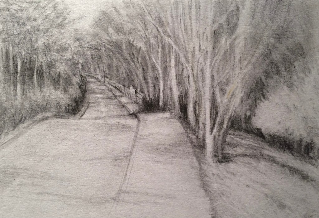
As I try to find my own creative style or vision, I’ve also been working in pastel and watercolor, using my own reference photos and sketches. An ascending road in wooded hillside near my home intrigues me but my paintings of it, so far, have been a struggle. So after the sheep drawing worked out so well, I carried some of the same techniques into the sketch below. Having drawn it like this, I know this place better and think any future paintings of the same location will be stronger.

Up California Avenue – graphite on paper – Peggy Willett 2021

I’ve also set myself the following 2021 goals:

  1. To develop a more disciplined and regular creative practice.
  2. To overcome my “blank page anxiety’ which I allow to keep me from marring that first perfect page in a sketchbook.
  3. To stop worrying about wrecking a piece of expensive watercolor or pastel paper. It’s just paper.
  4. To USE the (almost) embarrassing amount of art supplies I’ve acquired in recent months.

And I’ve found a new resource that I think will help me progress. “How to Pastel” a blog by Gail Sibley, has been a great resource in recent months, and I’ve joined her art-making membership community, “Ignite!” Having titled my own blog “Artfuel”, the word “ignite” resonates with me and I’m hoping the program structure will provide some much needed kindling to fire up my efforts this year.

So after a long dry spell, I begin. Again. Maybe that’s the point. To keep beginning.

Painting with Roger Whitlock

In January I began a series of weekly classes with Roger Whitlock, a notable watercolorist who lives in the Seattle area. He and his other students were all accomplished NWWS member painters, so I was initially a bit intimidated about painting in such company. But I’m glad that I did because I learned about new materials and techniques and met some lovely people in the class.

First, we learned a new (to me) technique for handling watercolor paper to manage its wetness at each stage of the painting process, without going through the tedious process of stretching and drying the paper before one can even begin. Big win!

Roger also offered valuable guidance for handling paint in ways to achieve bright clear colors and create strong values for a successful painting. He also encouraged us to use only big brushes in the early stages to avoid getting lost in the details.

We all worked from Roger’s reference photos and usually completed a painting in each session. The landscape below is from the first class, and uses two colors I’d never used before. Naples Yellow creates a warm glow at the horizon that grades to increasingly dark blues at the top. Surprisingly, Naples Yellow does not create a green where the yellow and blue meet. In addition, we learned that Viridian, a rather vile green on its own, is best used to darken other colors and make them more interesting, as in the foreground trees.

Painted from Roger Whitlock’s original photo

Our third lesson was about depicting subjects which are lit from behind, rather than from light shining directly on them. In the painting below I am most pleased that the strong darks on the left side add the real drama to this scene.

Painted from Roger’s photo of a Mexican scene

Group review sessions at the end of each class were truly helpful. We were all honest but generous and regardless of the skill level we each brought to the class, everyone progressed under Roger’s teaching.

A new series of classes with Roger was to have begun in March. But until we’re no longer all “artists in residences” due to pandemic virus concerns, I’m looking back through my older works with an eye toward painting some of them again, using what I learned from his classes.

The eggs and I

I learned to make Ukrainian Easter eggs, or Pysanky, from my college roommate. Throughout the 1970’s and 80’s, I made dozens and sold them to a few gift shops and art galleries for $5 each, which seemed reasonable 40 years ago.

As other interests prevailed, I put my egg making tools away. When I tried to make them again a couple of years ago, I found that neither my hand nor my patience are as steady as they once were. So I sent my dyes, waxes and kistkas to my artistic niece-in-law Wendy, to carry on the tradition in her own way.

I just figured out how to use a nifty film-to-digital converter called a Wolverine to digitize some photos of the eggs that I’d taken with a SLR camera. So I want to share them on this first day of Spring.

The colors on the old 35 mm slides have not aged well and I was a pretty dreadful photographer, but at least I now have some digital files that won’t further deteriorate. These photos show my range of colors and designs.

Copyright Peggy Willett

If you want to learn more about the batik dye process used to create Pysanky, many small websites offer Pysanky supplies and how-to’s. Surprisingly, one of the best detailed explanations of how these (inedible) eggs are made is at All Recipes.

I still have a few that I bring out to enjoy in each spring. My favorite egg in the photo below (so easily captured from my camera phone) is the one with the purple and pink, made by daughter when she was about ten.

photo copyright Peggy Willett

Art Will Save You

While walking home from my neighborhood art supply store, and thinking how lucky I am to have that creative resource in my backyard, this bold statement spoke to me from a small sign stuck on a light post.

photo copyright Peggy Willett

Save me? Save you? For what? From what?

Intrigued, I searched the phrase and found the Art Will Save You site.

Their ‘about us’ section presents the encouraging idea that the act of making marks, blending colors, trying textures and taking chances with new materials can save us as they spark explorations in new creative directions.

As the AWSY folks say, the phrase likely means different things to each of us. But it makes me happy. So I bought some of their stickers to give to people I treasure. I’m also using their neat little canvas zip bags in my art kit, in my purse and as gifts.

Each time I see that phrase it encourages me to keep fueling my art studies with new adventures; to keep going when I fail a drawing or painting.

Perhaps the idea that art will save you resonates with you, too. Whether your art is gardening, cooking, traveling, photography, filmmaking, painting, designing, collecting, dancing, gardening, music or more, it’s likely saving you. For what? From what? Up to you!

Brave Beginnings

A year-end studio cleanup found me sorting through stacks of practice paintings and drawings. The effort quickly became a self critique of what I’ve accomplished since leaving the work world and focusing on my art skills. 

Reviewing my efforts chronologically, I see progress, largely due to attending frequent artist lectures, demonstrations and workshops at Daniel Smith. This art supply store is an amazing resource for all kinds of art makers. I’ve also taken local figure drawing classes and online classes through Artists Network. When I’m stuck for ideas, I enjoy working my way through instructional books for design, drawing, watercolor and pastel painting. And I’ve spent more hours than I care to admit, watching watercolor demos on YouTube. I joined the Northwest Watercolor Society to connect with other local painters. I’m even volunteering for the group. In all, the past three years have given me a range of good experiences and now it’s time to find my personal style and become a bit braver about sharing my artwork. 

So this week I hushed my inner coward and entered my first competitive NWWS watercolor exhibit. I picked three of my practice works, all painted from my own sketches or photos, so they are my original work, rather than student exercises. I don’t expect to have any of my entries accepted this time as I am not in the same league as the painters whose work I’ve seen in several NWWS shows. But I think it’s good experience to learn to photograph and prep my images to the NWWS specs and then use their online entry system. (I actually uploaded the wrong file sizes initially, but with some help from another member, I finally did it.)

My entries:

Bloedel Path, 2018, Copyright Peggy Willett

I’ve done several pastel and watercolor studies of this path lit by a bright tree at the Bloedel Reserve. It was on this 2016 visit to the garden that I first saw a flyer for Julia Cameron’s book “It’s Never Too Late” about creativity for “retirees and other creative souls.” Her book set me on my own artful path, so it seems appropriate to enter a painting from the photo I took that day. 

Pearly Morning Alki, 2019, Copyright Peggy Willett

I often walk on Alki beach in the morning. It has a nice flat stretch of waterfront where I can do my two miles and then stop for coffee at any number of cozy places and watch ships and birds and people. I like the contrast between the soft edges of the trees, water and beach, and the hard lines of the walking paths, the seawall, the steps going down to the sand. Some mornings, the light is almost pearlescent. 

Mary’s Poppies, 2019, Copyright Peggy Willett

My daily walks to the market take me past my neighbor Mary’s rockery garden, which glows in summer with California poppies. This view is looking to the North and I really like the way the chain link fence leads your eye into the picture. 

My favorite study of her poppies, however, looks to the South. I could not enter this one into the NWWS show, however, because at just 5×7 inches, it’s too small. Perhaps I’ll paint a larger version next.

Poppies, 2019, Copyright Peggy Willett

An image continues to inspire

Long ago when I was making cloisonné enameled jewelry,  I made a series of reversible pendants that featured a waterlily on one side and an abstract design on the other.

My inspiration for the waterlily was a watercolor painted by John La Farge in the 1880’s, which is now housed at the Smithsonian in Washington, D.C.  In recent years this lovely image has been licensed to appear as framed prints, on greeting cards and likely many other media. You’ve likely seen it somewhere, too.

Using his work as my own starting point, I simplified and changed it in many ways to suit my pendant format which was usually a rounded rectangle about and inch by an inch and a half. I created and sold many variations over several years and I hope they’ve held up well and continue to give their owners pleasure. For me, the waterlilies and their more abstract  ‘other sides’ were a joy to make with up to 6 layers of various transparent colors on each side of the fine (pure .999) silver surface. The white metal base allowed light to reflect through the glassy layers, each fired separately in a super hot kiln, creating jewel-like colors that remind one of stained glass.  In addition to layering pure colors, I did a lot of blending and shading of colors in the leaves, flower petals and watery surface, making each piece unique.

Waterlily pendant
One of my waterlily pendants framed with a sterling silver bezel – made in the early 1980’s. I’ll show you the other side – an abstract design – another time.

I no longer make jewelry. I have mixed feelings about this. But I gave most of my tools and supplies to various artists and friends as my business career became my main focus for many years. However, I kept my sketches and a few photos and have recently begun to review them to see which might provide ideas or themes to carry forward.

A few months ago, I found a greeting card bearing John La Farge’s original water lily, which was like seeing an old friend. At about that same time I had signed up to study for a day with an amazing pastel artist, Barbara Benedetti Newton. I wasn’t sure what to expect but I took a few recent sketches and the La Farge card with me to her studio, to use as reference images. I decided to use the water lily for my project that day, in hopes that my being so familiar with his image would allow me to focus more on learning how to handle pastels with panache.

Barbara was generous with her expertise and even let me use a few of her own gorgeous colors to supplement my small pastel supplies. She also showed me how to use a toned pastel paper as a complement to my main colors and as one of the mid values I’d need in the painting. Barbara even gave me samples of other substrates for pastels – a whole new array of materials to consider. And her indoor dust capture system makes it possible to use pastels without breathing in their dust. Genius!

The following series of photos shows the steps Barbara helped me take to create in this medium.

BBN open studio value study phase 1
Step one, a rough sketch with a pastel pencil on an orange toned pastel paper. Above the tape you can see color tests. Then we blocked in the darkest and lightest points. Note the open wire grid below the panel, where a vacuum system captures any falling dust.

With pastels, colors are not mixed on a palette. Variations in color and texture are achieved by layering them in various light or heavy strokes.

BBN open studio lights on
Next I applied more lights and mid tones, leaving some paper showing to provide contrast.

BBN value check phase 2
At this point we took a photo and used the black and white filter to consider whether the values were on target to achieve what I wanted.  Once corrections were made I added final details below.

BBN open studio v3 cropped close
Finished.

The still visible marks and strokes and those final darks and lights make me happy. And it’s not overworked, thanks to Barbara saying “STOP!”  My time with her was a treat and I love knowing that she lives close enough to Seattle for me to consider her a neighbor. Do visit Barbara’s blog for more about her and to see her stunning work. She’s a treasure and her pastel ‘answer book’ is a goldmine for anyone considering this medium.

Back to dustless media

I’m struck with the vivid colors and immediacy of drawing and painting with pastels, but their dust creates an issue for me, at least for now.

I’ve taken some steps to avoid breathing the dust, such as wearing a mask and tilting my easel so the top of the paper is slightly toward me, allowing the dust to fall away from the surface into a collection bin. I’m also using the harder types of pastel, NuPastel and pastel pencils, which shed less dust than softer brands.  Between layers, I’ve also spritzed my drawings with an alcohol or water mist to ‘set’ them on the paper.

But last weekend when I was working on a new piece, the light was just right when the furnace kicked on and I began to see faint, smokey-looking wisps of very fine dust rising from the paper into the air and toward the cold air returns. Yikes!

Because most pigment colors come primarily from minerals and metals, it can’t be good for the fine dust to fly through our air ducts and be distributed throughout the house for us to breathe.

I clearly need to learn more about how pastel artists deal with this issue. And I’m researching dust management methods at various websites to see what other steps I can take.

This medium, for me, may best be used outside or in a separate studio; not my home. It will soon be warm enough to work outside and I’ll try them again then. For now, however, I’m returning to other tools – including dyes, ink, watercolor pencils and paints.  I used them all to interpret this reference photo of some red and white tulips against a dark background.

Tulip reference image
photo copyright by Peggy Willett, December, 2017 – please ask for permission to use

After drawing my composition lightly on some 140 pound hot press watercolor paper, I used an Inktense dye pencil to create a dark, soft background texture around the leaves and flowers. Painting clear water over pencil marks ‘melts’ them into a wash, just once, before becoming permanent. This ensured the background won’t leak into the lighter leaves and petals as I dampen the paper and paint them in with watercolor.

Step 1 Tulip watermedia

Next, I added some detail to the blossoms and leaves with watercolor pencil and softened these with water, too.

Step 2 tulips

I then added transparent watercolor paint to the leaves and some areas of the white blossom. I was slightly terrified to add the reds!

Step 3 tulips

Finally, I added darks and more vivid reds with Tombow pens, which are also water soluble.

Step 4 - final tulips

As soon as the weather warms, I look forward to trying a pastel version of this composition. Outside.

If you have any tips on containing pastel dust, I’d be grateful for your comments.


Pastel practice

Taking a break from watercolor and pencil drawing, last month I dove into an online beginner’s course for pastels at Artist’s Network. The instructor, Chris Ivers, offered the opportunity to follow her step-by-step demonstrations from her own reference photo. Here is my first effort to work along with her:

Pastel practice cropped

Next, I worked from my own photo taken on a walk in my neighborhood last fall.  I like this stand of bamboo and think the strong directional angle of the sidewalk makes an interesting composition.

Bamboo walk pastel

I like the immediacy of the soft pastels and the ability to layer and blend them. Even to brush off any mistakes and work over areas, building up rich color and texture.

Taking this online course also gave me the confidence to sign up for a one day workshop with a very well known pastel artist, who, I recently learned, lives near Seattle. I have long admired Barbara Newton’s pastels, and I am delighted to have the opportunity to study with her next month.

Now, back to more practice.