Back to dustless media

I’m struck with the vivid colors and immediacy of drawing and painting with pastels, but their dust creates an issue for me, at least for now.

I’ve taken some steps to avoid breathing the dust, such as wearing a mask and tilting my easel so the top of the paper is slightly toward me, allowing the dust to fall away from the surface into a collection bin. I’m also using the harder types of pastel, NuPastel and pastel pencils, which shed less dust than softer brands.  Between layers, I’ve also spritzed my drawings with an alcohol or water mist to ‘set’ them on the paper.

But last weekend when I was working on a new piece, the light was just right when the furnace kicked on and I began to see faint, smokey-looking wisps of very fine dust rising from the paper into the air and toward the cold air returns. Yikes!

Because most pigment colors come primarily from minerals and metals, it can’t be good for the fine dust to fly through our air ducts and be distributed throughout the house for us to breathe.

I clearly need to learn more about how pastel artists deal with this issue. And I’m researching dust management methods at various websites to see what other steps I can take.

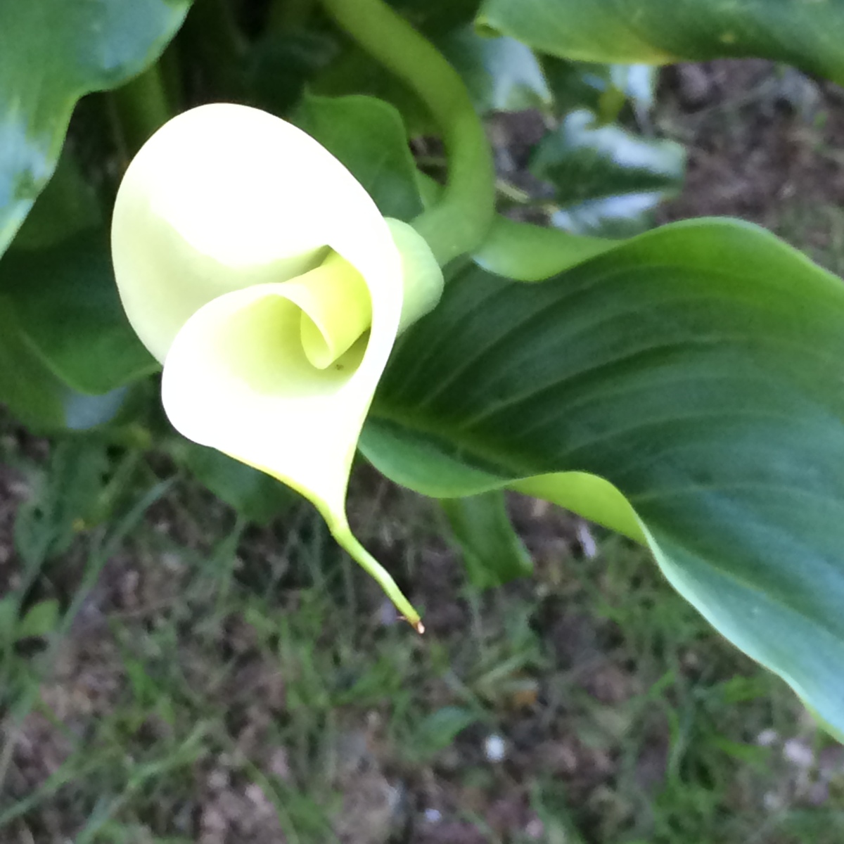
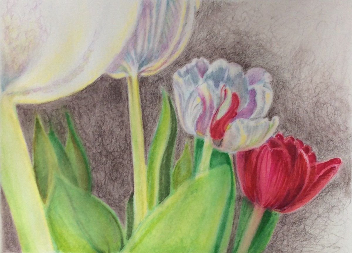
This medium, for me, may best be used outside or in a separate studio; not my home. It will soon be warm enough to work outside and I’ll try them again then. For now, however, I’m returning to other tools – including dyes, ink, watercolor pencils and paints.  I used them all to interpret this reference photo of some red and white tulips against a dark background.

Tulip reference image
photo copyright by Peggy Willett, December, 2017 – please ask for permission to use

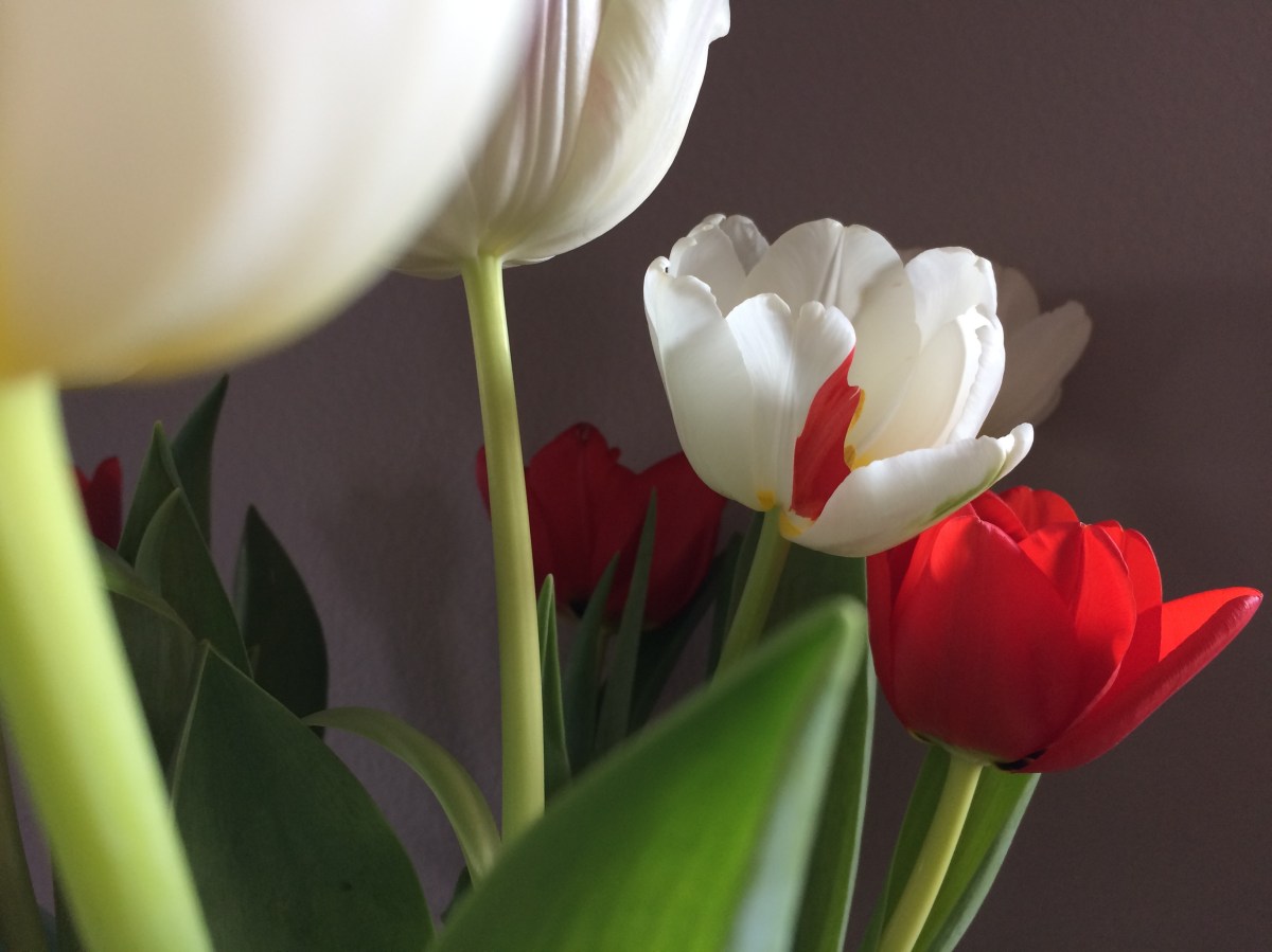
After drawing my composition lightly on some 140 pound hot press watercolor paper, I used an Inktense dye pencil to create a dark, soft background texture around the leaves and flowers. Painting clear water over pencil marks ‘melts’ them into a wash, just once, before becoming permanent. This ensured the background won’t leak into the lighter leaves and petals as I dampen the paper and paint them in with watercolor.

Step 1 Tulip watermedia

Next, I added some detail to the blossoms and leaves with watercolor pencil and softened these with water, too.

Step 2 tulips

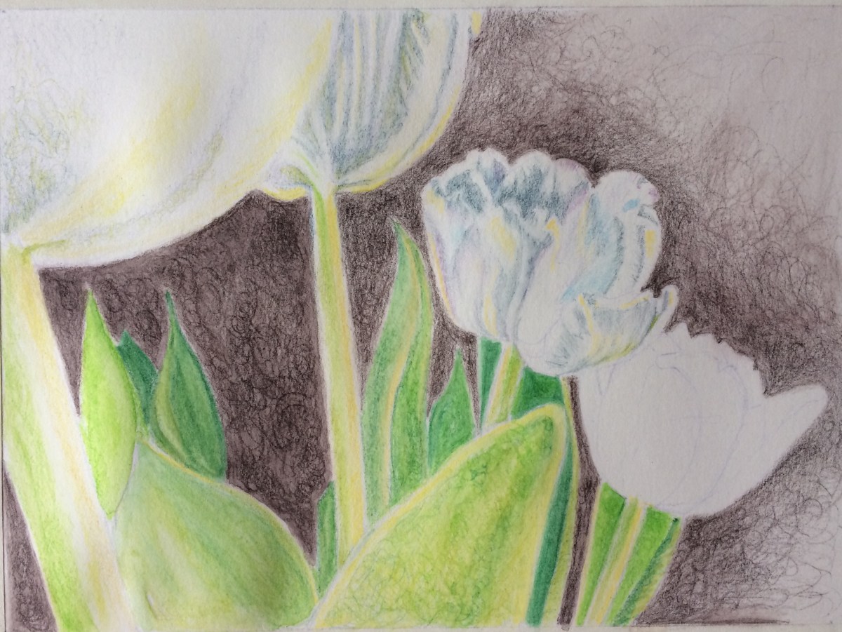
I then added transparent watercolor paint to the leaves and some areas of the white blossom. I was slightly terrified to add the reds!

Step 3 tulips

Finally, I added darks and more vivid reds with Tombow pens, which are also water soluble.

Step 4 - final tulips

As soon as the weather warms, I look forward to trying a pastel version of this composition. Outside.

If you have any tips on containing pastel dust, I’d be grateful for your comments.


Experiments in Pink

Today’s WP daily prompt is PINK, so it’s a good day to share some recent sketches of a day lily I photographed in my garden last June. A few weeks ago, using a combination of Tombow pens, watercolor paint and Inktense pencils, I created a satisfying range of pinks in these two versions:


Though their name prepares us that each lily flower will last only one day, I am amazed the plant expends so much energy for such short lived beauty! When these beauties are in bloom, I try to spend time in the garden each day so I don’t miss a single blossom.

Who are your creative influencers?

I’ve always admired American painter Richard Diebenkorn (1922 – 1993) and today I was struck to recognize his influence on some artwork I created years ago in a totally different medium.

Diebenkorn’s Ocean Park series series has long fascinated me for reasons I don’t fully understand. But one of our first purchases as a young couple was a framed Diebenkorn poster featuring his 1970 painting, Ocean Park #29. We’d just moved into our first apartment in a small college town and though money was tight, we splurged on some art for our walls.

Fortunately, the Diebenkorn poster survived many moves and currently hangs in my ‘studio.’ So it was very convenient to use as a reference for my first watercolor pencil exploration.

I hoped that by recreating #29 in a very small size and a different medium, I could quickly practice drawing, try out the pencils and understand more about why this particular painting charms me so. Why was Diebenkorn using this color next to that? What was his purpose using the diagonal while line? How does he blend his colors and lines?

Though Diebenkorn worked in oils for his OP series, I was also eager to see whether I could hold a firm edge between various watercolors while still making something painterly.

In my homage to Mr. Diebenkorn, below, my jewel tones evoke transparency and light.

deibenkorn-homage-1

I based another sketch, below, on his Ocean Park #79 (1975).

Reinterpreting the Diebenkorns does not make my qiuck sketches original art. But studying them in this way has simply helped me learn more about his work and how I might apply what I’ve learned in the future.

deibenkorn-homage-2

However, this morning, as I was dusting off and browsing through some old design sketchbooks from my jewelry making days, I could see his influence in my series of cloisonne enameled pins/brooches and pendants. These three pieces relate to his work, but I never realized that until today.

enameled-jewels

Perhaps our influencers affect us differently at various times in our lives.

Whose influence fuels your creativity?


They say it takes two…

…Two people, that is, to create an artwork.  One to bring it into existence and another to say “STOP” when it’s finished.

Have you ever taken a good drawing or painting too far and ruined it?

I’ve blown up several sketches over the past couple of days, but I DID draw or paint each day so far this year. All five days of it. And I am not ashamed to share a couple of  watercolor pencil drawings/paintings.

Working from photos I took in my garden last May, these made me happy today:

Reference photo from May, 2016:photo-for-calla-wcp

My water color version, January 4, 2017:

wc-calla-mid-stage

I liked this but went further with it. Looking at the version below, I wish I’d listened to that voice that said, Stop!

Final Calla Lily, January 4, 2017:

Calls Jan 4 FINAL.png

I am not sure the addition of the small leaf at top right adds anything to the composition, though I do like the more atmospheric areas around the flower and leaves and the darker values add drama.

I’m glad to have photos of both stages so that I did not lose what I liked about the first version.

Today, I drew from a different reference photo, also from May 2016:

calla-for-jan-5-wcp

My January 5 interpretation, in watercolor:

calla-jan-5-final

Callas are dramatic flowers and interesting to draw.

Years ago, I made jewelry and created many cloisonne enameled pendants featuring this flower. I sold them all but wish I had kept one.  My original design sketches and photos of some finished pieces are tucked away somewhere. It might be time to review them and see what I can learn from them this year. I sense the need for another round of closet cleaning to find them. Oy!

However, for now, I am excited that new callas will emerge in my garden in a few months.

The days are already lengthening and I know that Spring is coming.

Inspiration from my garden

Something is always blooming in Seattle and my small garden offers a constant parade of subjects for drawing and painting. Much more fun than weeding!

This photo taken in late fall, looking down from above a large ceramic planter, shows fading heuchera and Japanese forest grass leaves above a cascade of flowering rosemary. I liked the composition enough to use as the basis for a watercolor sketch.

img_0524

I’d recently found some dusty art supplies that had been tucked away for years in various parts of the house. Among them was a set of watercolor pencils that I don’t recall buying and didn’t really know how to use. The colors were not impressive to draw with, but when I brushed water over the pigments, they became more vibrant as they melted and blended together. These could be interesting.

I used a grid system to transfer the design from the photo to a larger sheet of paper. Treating each square of the grid as a small abstract on its own, lets me concentrate on each section’s shapes, values, colors and textures. The grid marks can be erased, painted over or treated as design elements, as I did in this color sketch.

color-sketch-no-border