Delicious colors

I am always looking for interesting objects to draw for practice. I found some beautiful radishes with frilly leaves and gnarly roots and placed them on a glass table, where they created interesting shadows and reflections as the sunlight changed over the course of a couple of hours.

Radishes copyright Peggy Willett

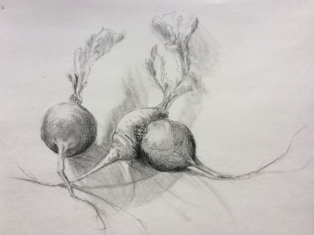
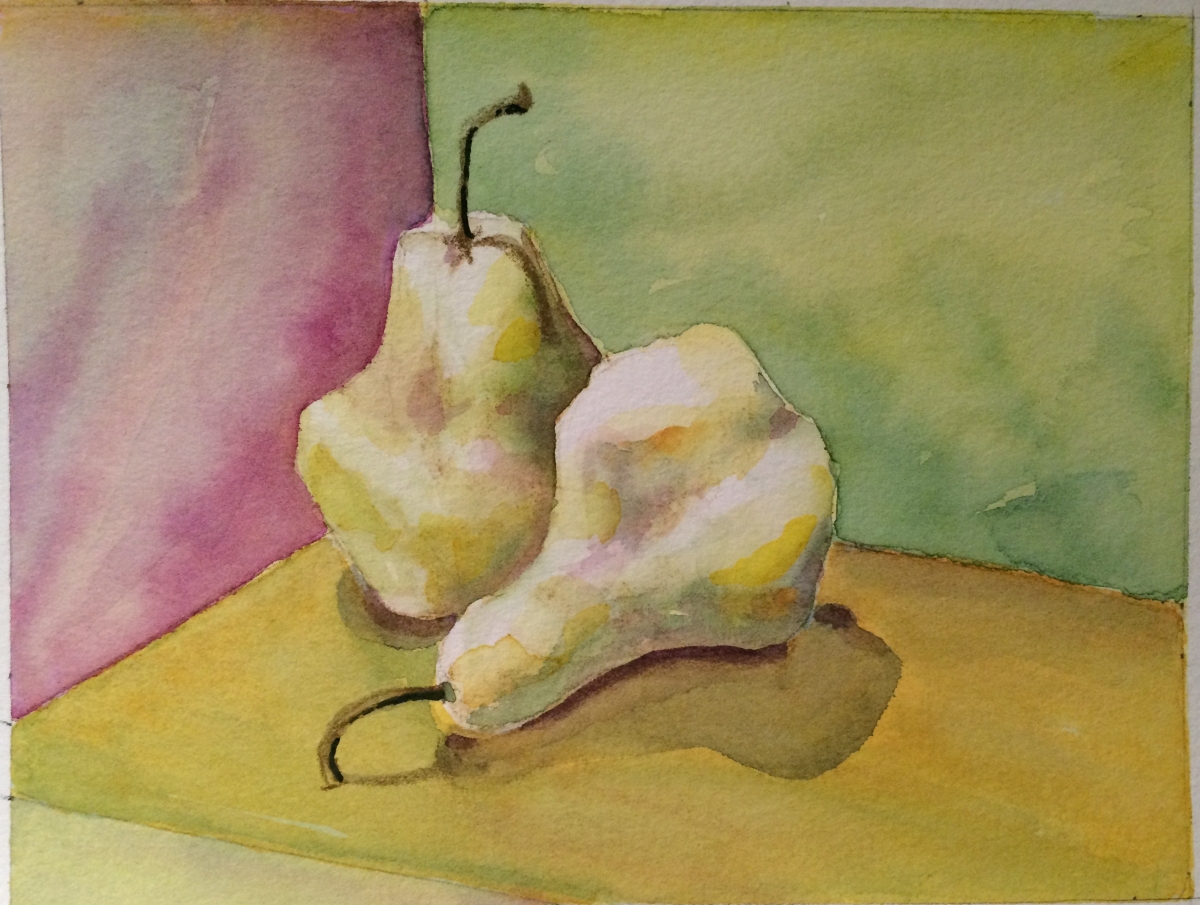
Translating this composition to watercolor, I added a horizon line so the radishes would not seem to float in space.  As with the pear paintings, I limited my palette to three colors, mixed and applied (patiently) in layers.

This is Quinacridone Rose, Aureolin (Cobalt) Yellow and Pthalo Blue. I used masking fluid to retain my lightest areas. Removing it damaged the thin, 140 pound paper in a couple of places. Grrr. Radishes 1 copyright Peggy Willett

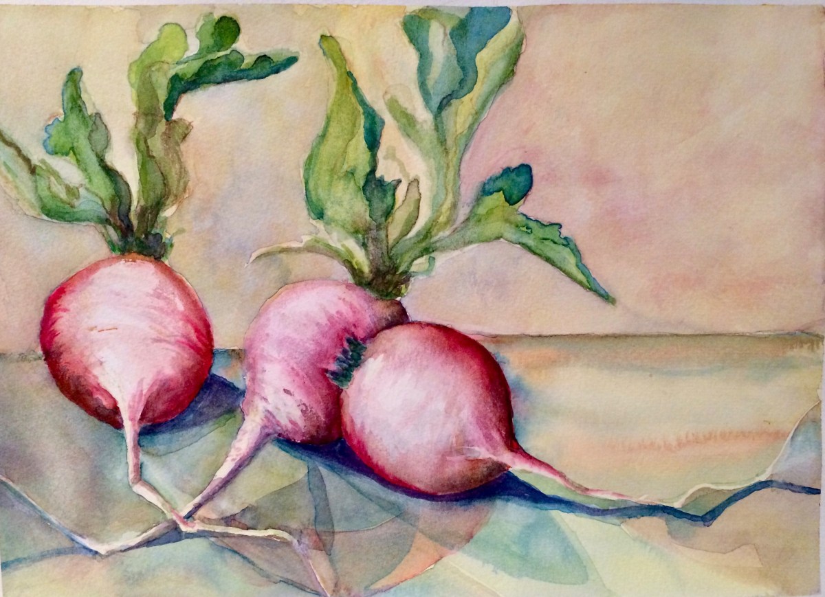
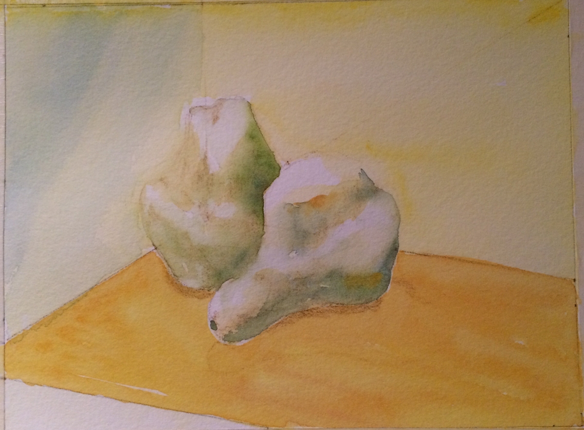
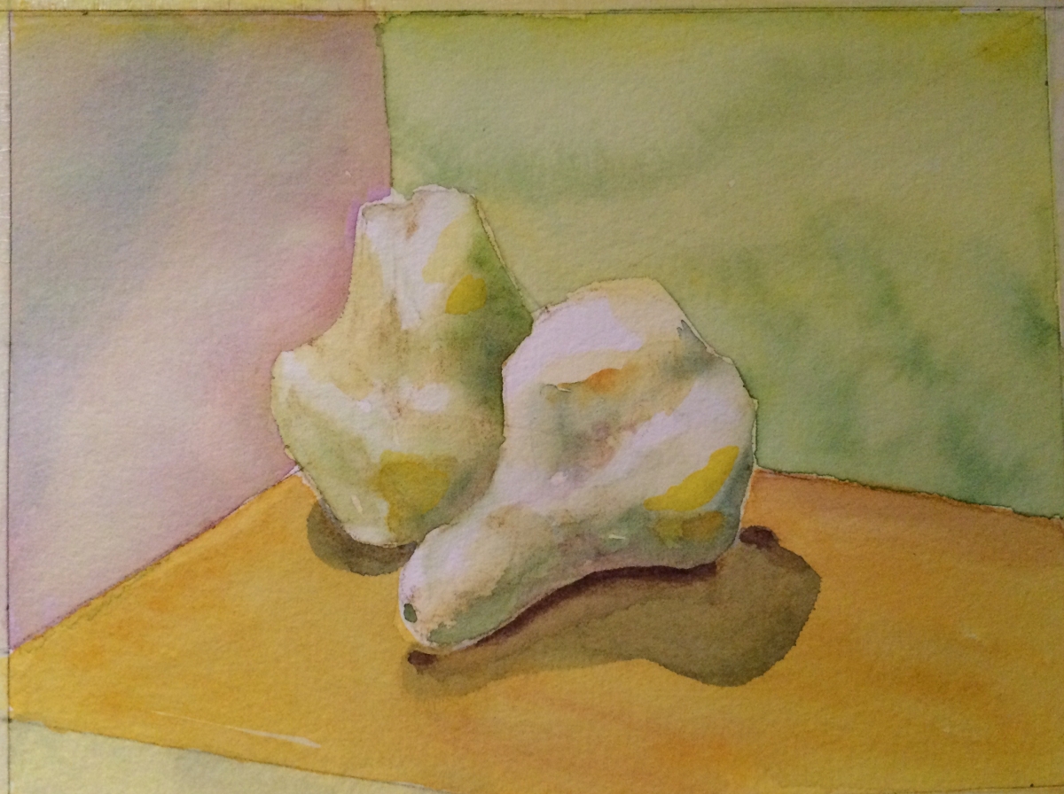
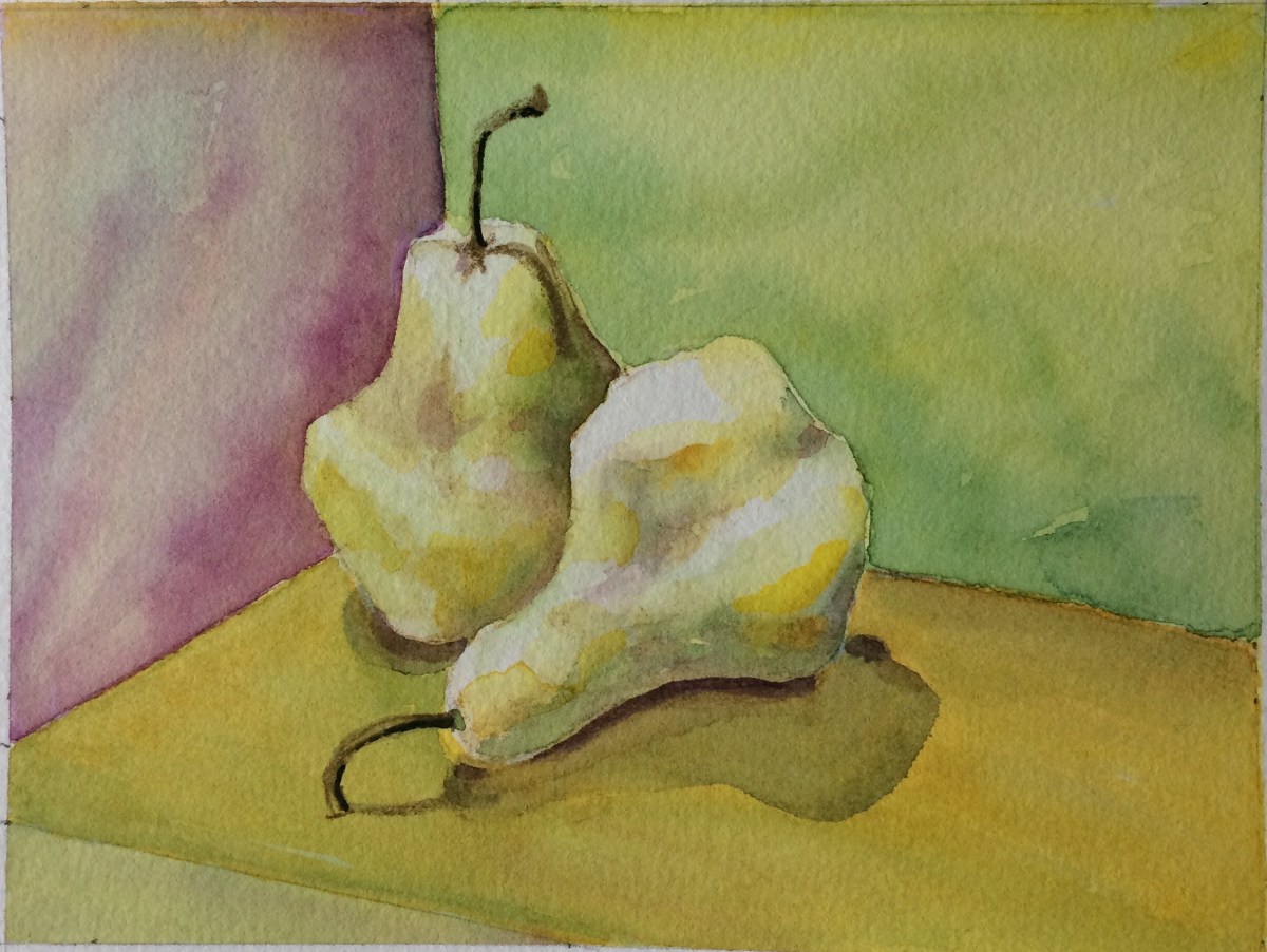
I like to work in a series, so next I splurged and used a sheet of 300 pound paper. These sheets are mounted in a block and glued on three edges so they do not buckle when wet. No stretching and taping required. I love this stuff!

I changed my blue in the next two paintings to Prussian Blue. The masking fluid came off this paper without incident.

Radishes 2 copyright Peggy Willett

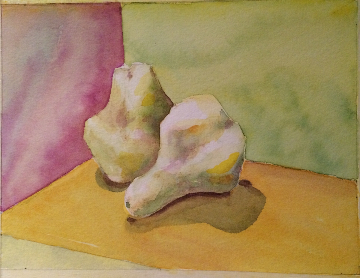
I took what I learned from the first two and painted one more version on the back of the heavier paper. I’d removed it from the block and used no masking fluid this time.  I got brighter greens with overwashes of pure yellow but they were SO bright that I pumped up the red in the radishes to balance the values. This version was painted the fastest and with the fewest brushstrokes.

Radishes 3 copyright Peggy Willett

I’m feeling more comfortable with watercolor as I paint more frequently.  And I’m feeling better about my drawing skills.  Onward to more complex shapes as I work my way through the pantry and into a figure drawing class.


Watching paint dry

Watching paint dry is a phrase we understand to mean the epitome of boredom. But taking the time to literally watch watercolor paints dry can be surprisingly interesting and may just be the key to success with this medium.

I’d read and heard about the need to let colors and paper dry completely before adding a new layer of paint, but doing so seemed too slow and disruptive. Now I know that rushing the process simply produces a lot of muddy colors and abuses a lot of expensive watercolor paper.

I’m finally seeing that having the patience to watch the paint dry – or to walk away and do something else for awhile, is the way to build bright, luminous layers of color. The colors change as they settle into the paper and moisture evaporates. They mingle, separate and granulate, sometimes creating ‘blooms’ and run backs that add texture and interest. Watching this happen can be mesmerizing. Very zen, eh?

To show what I mean, here are several of the steps I took to develop a painting of pears. To keep colors harmonious throughout, used just three colors: Quinacridone Magenta, Pthalo Blue and Hansa Yellow, allowing each layer of paint to completely dry.

First layers
Step 1 – started with an overall yellow wash followed by separate washes of pink and blue.
step-2-pears-process.jpg
Step 2 adding more layers and more definition to pears – note the ‘blooms’ in the green background and how the blue and pink colors have separated in the pink area
step-3-pears-process.jpg
Step 3 – more intense colors added
Two Pears final C Peggy Willett
Added final details – stems and shadow and darkest value under the pears. A final light green wash over the foreground to calm that color slightly.

One year later…

I began my blog almost exactly a year ago with several goals in mind:

  • To document my efforts to be a more creative person after leaving my work life.
  • As a way to share my retirement journey with friends and family.
  • To connect with others who are figuring out their own ‘seniority’ and creativity.
  • To keep and improve my writing and computer skills.

Though I hit a creative block for a few months and I’ve not posted recently, I’ve made some progress toward all these goals and hope to write more frequently in the new year.

So I begin again!

I continue to struggle with watercolor. The medium confounds me most days! So I took a break from the paints for a few months to work on my basic drawing skills, which I think will eventually make me a better painter.

Over the summer and into the fall, I drew various fruits and vegetables which were at hand from my pantry.  Good practice for form, composition and values.

Two pears

Now, I am trying my hand at translating some pencil drawings to water color.

Two pears in watercolor

More to come!

Experiments in Pink

Today’s WP daily prompt is PINK, so it’s a good day to share some recent sketches of a day lily I photographed in my garden last June. A few weeks ago, using a combination of Tombow pens, watercolor paint and Inktense pencils, I created a satisfying range of pinks in these two versions:


Though their name prepares us that each lily flower will last only one day, I am amazed the plant expends so much energy for such short lived beauty! When these beauties are in bloom, I try to spend time in the garden each day so I don’t miss a single blossom.

Creative Synchronicity (Part 1)

JOSEPH RAFFAEL’s HELLEBORES

In her book about creativity and retirees, Julia Cameron warns (or perhaps promises) that ‘aha!’ moments – ephiphanies about creative synchronicity – occur when we nurture our innate creativity and pay attention to the world around us.  Recently, I’ve begun to  experience such instances and I am seeing more connections between my long ago artist self, what I am doing now and others’ creativity.

Perhaps these examples of creative syncronicity have swirled around me, invisible as air currents, for years, when I was just too terribly busy to see them. Now I am making time to study my art influencers anew and taking steps to make art again. With the luxury of time to savor these efforts, I begin to feel lightbulbs illuminating above my head.

For example, a few days after I posted about my hellebore sketches, which were prompted by Susan Rushton’s luscious photos of these early spring bloomers, I received a new edition of artist Joseph Raffael’s newsletter, announcing his own new stunning hellebore painting.

I’ve long respected Raffael’s work and it was a joy to see his painting on the same subject I’d been working on. His hellebore painting felt like a gift, showing me how much more I could possibly achieve with watercolor in the future.  He even focused on a side view of one blossom and it’s complex interior that I’d found interesting, too.  (My side view is posted above, but go to Joseph’s site to see his elegant interpretation.)

The first Raffael painting I encountered was one of his “Water Paintings” at the Chicago Art Institute.  Forty years ago, that massive riverscape dazzled me with shimmering surfaces, jewel-like reflections and mysterious watery depths,  He inspired me to try to capture light in my own work in various translucent and transparent media, including glass enamels, watercolors and stained glass.

Raffael’s art currently explores the complex worlds contained within a few flowers or a single blossom. He continues to amaze and inspire. You can sign up for his newsletters at his site and follow his new work as he completes each painting.

Enjoy!

Thank you, Susan Rushton

Several weeks ago, I was itching to try some new art tools. I’d treated myself to a starter set of Inktense pencils and dozens of new Tombow markers. But I was stumped for subject matter.

Fortunately, I follow Susan Rushton’s blog. Her early February post and photos of seemingly ‘demure’ hellebores revealed stunningly complex and fascinating flower interiors normally hidden from view.  Wow!

The hellebore’s downward-facing flowers had seemed, until then, uninteresting in the early spring garden.  But Susan’s images and comments changed my mind and inspired me to visit my local nursery, where I found several varieties, capturing some reference photos for my test sketches.

Just yesterday, Susan posted again about hellebores, so the time seems right to thank her for her for giving me a new appreciation for these garden charmers.

Here’s how I’m seeing them in a few sketches using Inktense dye pencils, overlaid in some cases with watercolor, and with Tombow pens, which blend beautifully.

helibores inktense sketch March 2017

two helibores March 2017

helibore side show B March 2017

lighter side show helibores

helibore upclose March 2017

Edward Hopper: Color and Contrast


A great luxury and pleasure in retirement is having as much time as I want to read and think. I’m re-reading art books I’ve not touched in years and am finding new insights about why some artists resonate with me so strongly.

In addition to Richard Diebenkorn, I admire the work of American painter, Edward Hopper (1882-1967).

Two of Hopper’s most famous figurative works, Chop Suey (1929) and Nighthawks (1942), may be familiar to you.

His later works, including Rooms by the Sea (1951) and Sun in an Empty Room (1963), present strong lights and shadows in simpler, almost abstract ways which remind me of Diebenkorn’s Ocean Park series. Hopper was the older of the two notable artists, and it’s more than possible that Diebenkorn was aware of and influenced by Hopper’s work. I like to think so.

Both artists are in my mind these days. I love the Diebenkorn abstracts and Hopper’s bold colors and values. As I begin to draw and paint again after many years, I struggle to make the right value contrasts and my palette is beginning to feel a bit timid. But I draw courage from Hopper’s powerful and stunning use of color, light and shadow.

In this watercolor study, I imagined Hopper’s Rooms by the Sea through a Diebenkorn ‘lens.’  In doing so, I learned that I still need to work on my values contrasts, and I need more confidence with color and form.

hopper-4

Artists Wolf Kahn and Josef Rafael also inspire me and I will write about them in future posts.

Who influences your work?


The color in the shadows

It’s cold and rainy this week in Seattle and I am housebound today with a wrenched back. Perhaps I was overconfident in my yoga classes last week. The extra backbends seemed like a good idea at the time.

However, I want to put a new header image on the blog so I went back to the well of my garden photos from last May and drew/painted a a series of small calla sketches, about 1.5 inches each, to get the right proportions for the wide, narrow header.

callas-for-header-image-cropped

I’m happy so see that I’m loosening up with the watercolor pencils and paints. The small scale of these sketches also forced me to simplify. Applying what I learned today I will make a larger version of each little sketch later this week as I continue to explore these fascinatingly-shaped flowers.

Though these callas are white, they reveal so many other colors in their folds and shadows.

I first saw colorful shadows in Santa Fe, where the elevation and brilliant sunlight created the most amazing purple and green shadows in the corners of adobe walls and buildings.  I had never seen this where I’d grown up, in Ohio.

On sunny winter days, look for colors in snow shadows; they are never just gray. There are so many colors in the icy crystals as the sun changes throughout the day.

Have you been to other places where you’ve seen this phenomenon of color in shadow?